Introduction
Welcome to the first entry in our new “Website Builder Widget of the Week” series. Over the course of five posts, we’ll introduce our pick of the five most useful widgets for Website Builder. These will be not just the essential “must have” widgets for any website, but also those that are the most creative and eye-catching, perfect for attracting the interest of all who see them.
For your website to truly succeed it needs to stand out from the crowd and wow your visitors, which is where Website Builder’s impressive collection of widgets and features comes in super-handy!
We’ll start off with a widget that we feel is often overlooked but, if used properly, can really showcase your services in an incredibly attractive way: the Before & After widget.
What is the Before & After widget?
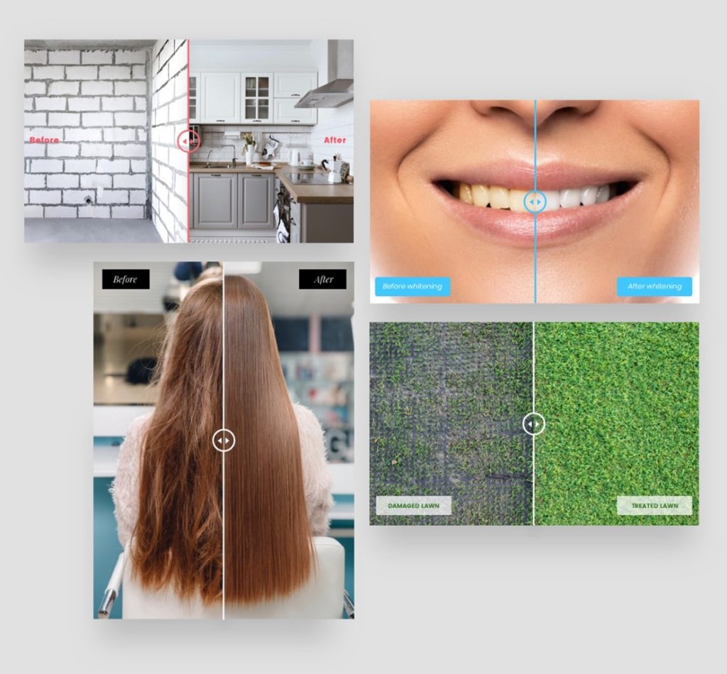
Maybe you’re a dentist or a hairdresser? Perhaps a gardener or a builder? Imagine being able to demonstrate on your website exactly what amazing results your work can achieve; an eye-catching and engaging visual comparison that will grab people’s attention.

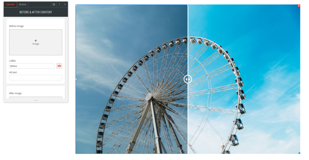
A slider bar going down the middle allows your customers to switch between the “before” and “after” results, and see for themselves exactly what the differences are. It’s a fantastic way of showing just what you can do – a unique and appealing feature that will get people interested and excited about your services.
How does it work?
Using the widget really couldn’t be easier. You simply just upload your “before” and “after” pictures and everything else is taken care of for you.
Here’s a quick walkthrough:
Open the Widgets section of your Website Builder editor and look for the Before & After widget. It’s usually located around halfway down the list, in the Media section. Drag and drop it to wherever on your website you would like it to appear.

In the pop-up window that appears you can click on the + icon in the Before image and After image sections to upload your two pictures.
Which images work best?
For this widget to be at its best and amaze your customers, you’ll need to ensure that both pictures are taken from the same angle and at the same viewing distance. It’s no good if one is zoomed in and the other isn’t, as the effect will be lost. When taking the “after” picture you need to ensure you’re standing in the same place as you were for the “before” picture, and that the background objects are all identical. Avoid any jarring discrepancies that will distract the viewer’s attention away from the central subject of the two pictures.
How is it best used?
The Before & After widget can be widely used to promote a vast array of services.
Here are some common examples:
Hairdressers: Take before and after pictures of your clients’ hair to show just what magic you can work.
Cleaners: Imagine a picture of a dirty floor sliding across into a picture of the same floor, but completely spotless. A great way of attracting new custom.
Gardeners: An unruly garden turned into a landscaped work of art with just the swipe of a finger! A fantastic feature that will show just how effective your skills are.
Painters & Decorators: No need for prospective customers to imagine how good your work is, when they can see the transformation right there on the website.
Builders: Take before and after pictures of gutters you’ve repaired, roofs you’ve replaced, houses you’ve renovated. The possibilities are endless!
And many more….
Attract new visitors, show off your skills and make your website stand out from the competition with the simple yet effective Before & After widget, included in every Website Builder plan.
Coming Soon…
In the second part of this five part guide we’ll explore a widget that has become increasingly popular over the last 18 months – the Zoom Meeting widget. You’ll discover how easy it can be to meet and chat with your customers, even if you can’t see them in person.
